People tend to think of design as a visual form of communication, but designing for information goes way beyond the visual. Content is present everywhere you look in product interface — product copy, button text, help content, user-generated information…
Content is what gives interface meaning and function. Jeffrey Zeldman summed it up well when he said: “Content precedes design. Design in the absence of content is not design, it’s decoration.

Zeldman’s comment touches upon the importance of Informational UX. The user experience of Informational UX is about how your users experience the information present in your product UI. It aims to provide clear, structured and helpful information to help users navigate a product interface and achieve their goals.
Picture a landing page developed to present information to the end user. It does so with a combination of content elements including images, text, navigation tabs, buttons, and microcopy. It’s created with an end goal in mind — to inspire the page visitors enough that they would willingly submit their email address.
So how does one create a web page that can persuade a visitor to take the desired action? That will depend on a designer’s ability to curate all pieces of information into a cohesive narrative. In short, it will depend on your ability to create the best possible informational user experience.
The Key Elements of Good UX Design
In my experience working on Informational UX for web and mobile products, I can identify three pillars which make up a great informational user experience.
1. Excellent Information Architecture
In order to give a piece of content a logical structure, you need to create a blueprint to serve as the basis for interacting with the website. This is where Information Architecture comes into the picture. Put simply, Information Architecture (IA) is the process of organizing, structuring, and presenting content in a manner that makes it easier for users to understand how everything fits together.
For an Information Architecture to be effective, a product’s elements have to be presented in a way where the generalized structure is readily apparent to the user. Good Information Architecture of a website, web app or mobile app presents disparate pieces of information in a way that makes it easier for a user to navigate, search, and understand.
An effective Information Architecture should be able to accomplish the following:
- Let users know they’re in the right place.
- Make it easy for them to find what they’re looking for
- Make them aware of their options.
- Make it clear to them how to take a desired action.
On a website, Information Architecture has to do with how your pages are classified, labelled and organized for easy wayfinding. For mobile app products, internal linking of components and modules are crucial for an intuitive navigational experience, since classical IA elements such as breadcrumbs are not used in mobile apps.
2. Outstanding Content Readability
You have hired a wordsmith to craft sophisticated web copy, but analytics reveal that your site visitors aren’t engaging with your content. Your content might be poetic, but is it readable enough to hold your visitors’ attention?
On the web, people don’t read. Research suggests that people scan through 50-60% of a page. They scan and skim. The F-shaped web reading pattern is still relevant, and backed by science. For a user-centric product, it is crucial that your content is written to be read by humans according to their reading habits.
But what defines content readability? To get a better understanding of what makes a piece of content readable and accessible, let’s enumerate the four essential components of readability as explained by researchers William S. Gray and Bernice Leary.
- Content: Arguments, structure, and coherence.
- Style: Involves word and sentence choices. Using simpler words, shorter sentences, and doing away with jargon, for example, can enhance your copy’s readability.
- Design: Involves typography, layouts, and illustrations.
- Organization: Using structural elements such as headings, subheadings, and bullet points can help break up your copy into more readable pieces.
3. Captivating Microcopy
Informational UX doesn’t end at page-level content. Great user experience is supported by microcopies that appear on a button, a pop-up modal, a confirmation message, or a form label text. Microcopy is short tidbits of text that serves to contextualize a specific use case. The rise of microcopy in UX design proves to us that every piece of information matters for a great product experience.
Unlike long-form content that relies on weaving a coherent, logical narrative through storytelling, microcopy is succinct and goal-driven. It often appears in contexts where the user is on his/her path to achieve a goal: whether it’s signing up for a newsletter, purchasing an item, submitting a form or correcting an action made in error.
Success in microcopy is measured differently from other forms of copywriting. Indeed, a whole field is now consolidating around the practice of writing, evaluating and iterating on this kind of copy; UX writing. Essentially, the main goal is to capture the voice of the brand while facilitating the user’s experience when interacting with product UI. Great microcopy should:
- Explain to users how things work, and;
- Elicit an emotional response from them.
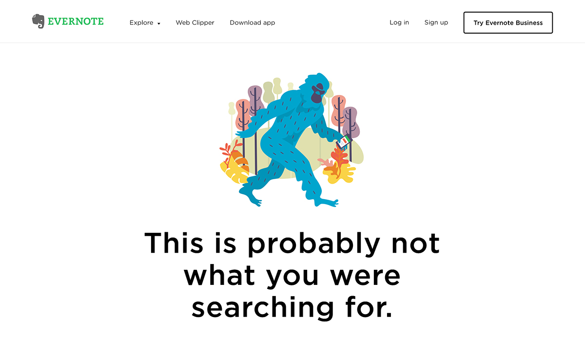
Although very much goal-driven and functional in nature, microcopy can take on brand personality too. Take the Evernote 404 page below for example. Instead of using the standard “Page not found” message, Evernote took this opportunity to lighten up the mood a little at a moment of user frustration.

Tips for Doing UX Design Right: An Informational Approach
So what steps can you take in order to improve your UX design by way of such an informational approach? Let’s take a look!
1. Perform User Research
Getting to know your user’s needs, pain points and knowledge gaps is instrumental in creating an effective informational UX strategy. User research leads to user personas that help you understand the best ways to communicate with your user.
User personas help to inform effective information design in the interface. Personas answer key questions such as what information does the user already have, what more do they need, and how do they process information. With such knowledge in mind, UX designers and writers will work towards filling the need gap with useful content that speaks to the user.
Take Mailchimp for example. Made for marketers by marketers, Mailchimp is highly educated in who their target users are and what brand voice speaks to them. The brand’s persona-driven approach to UX copy is reflected in Voice & Tone — Mailchimp’s content guidebook — which puts the readers feelings at the center, from success messaging to newsletters.
2. Create A Clear Content Hierarchy
When designing a webpage, you have to make it clear to the user that they are in the right place, and make sure that the user knows where to go to get from point A to point B.
To pull this off, the most important information should be placed at the top and down the left-hand side of the page. Remember, users are inclined to scan pages in the shape of an F — from left to right, top to bottom.
NNGroup also suggests tips for better content hierarchy such as highlighting keywords, including a meaningful subheading, bulleted lists, short paragraphs, inverted pyramid structure (start with the conclusion), and cutting word count by half.
As an added tip, use imagery to further improve your product’s Informational UX. Visual elements not only make your webpage look appealing, they also provide the additional context needed to make your web copy resonate more with the user. Appropriate use of imagery will not only bring out your brand voice more, but trigger user emotion as well, such as the use of high-impact, human-interest images.
In addition to clear on-page content hierarchy, Information Architecture also helps to create a clear wayfinding system for your user. Based on user research, you need to take into account the user’s needs to create a navigational system that brings helpful content to your users right when they need it.
3. Optimize Towards Conversion Goals
UX is never done without constant monitoring, analysis and iteration. We can collect meaningful usage data to help us monitor and improve informational UX along the way.
You could have well-written content and a kick-ass information architecture, but a large majority of your visitors aren’t signing up to your newsletter or making a purchase. At the end of the day, Informational UX serves to achieve business goals. Having clear goals in mind and collecting relevant statistics helps us measure how effective the informational UX is.
Optimizing towards conversion first requires us to identify the appropriate goal for a particular page. For instance, the success of a landing page with a sign up CTA would be determined by sign-up rate, while the success of a multi-step shopping form to fill in customer details would be determined by completion rate.
After we’ve collected usage data and determined areas of improvement, we can then conduct usability tests to probe user behavior, identifying what went well and what didn’t meet their expectations. By analyzing behavioural data, we can spot patterns of common behavior and adjust content accordingly. For example, are most users reporting that the menu label confuses them? Does it occur often that users click on the wrong button when closing out a modal? Are visitors leaving your landing page too soon? These are all cues for product designers to investigate and improve their Informational UX.
Conclusion
Knowing which part of Information Design matters to your users already sets you above your competitors. With the actionable tips provided above, I hope you can create a seamless Informational UX for your user, so they keep coming back to your product — a win-win scenario for all!

